

Deciding where to place your agents
With an SDK you can place a link to launch your agent from anywhere in your product. Increased agent entry points is the key to drive user activation. Here are several examples of places you can place your Call to Actions to launch your agent:| Pages and Flows | Use Case | Description |
|---|---|---|
| (Default) Floating Action Button | Onboarding Support Feature Discovery | At the bottom right-hand corner of your product, a circle with a question-mark will appear. And you can use Google Tag Manager to add your agents to this element. |
| New User Modals | Onboarding | Provide new users support right away |
| Onboarding Center | Onboarding | Target onboarding focused users in your onboarding center |
| Help Center | Support Onboarding | Target users who need support |
| AI Chat Bots | Support Onboarding | Provide your users the option to switch to a voice modality within your AI Chat Bot |
| Sidebar | Support Onboarding | Offers high visibility support at any stage of the user journey |
| New Feature / Release Modal | Feature Discovery | Introduce new features with the ability to explore them together |
| Empty States | Onboarding Feature Discovery | Offer support on features that are new to the user Note: This should be paired with another, more persistent option to allow your users to return to this |
Call-to-Action component
Call-to-Action (CTA) components are how users launch your agents inside your product. When a user selects a CTA, a small, draggable call window appears on top of your product UI. This window shows the agent’s name and a button to start the call. The default CTA is a Floating Action Button, but you can create custom, brand-aligned components to match your product.
Customize your UI
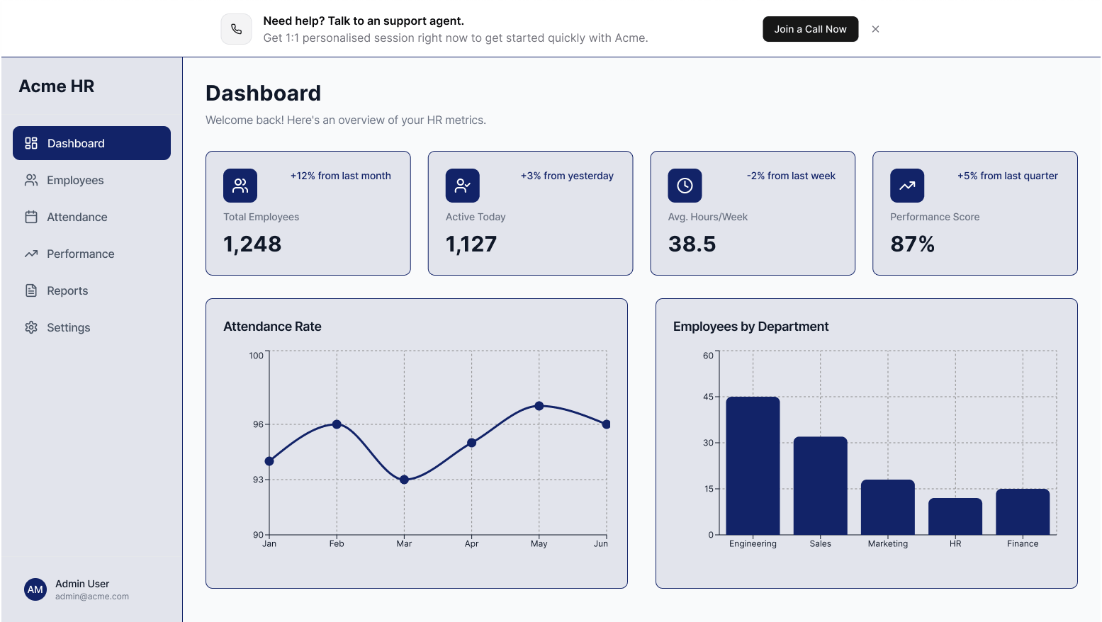
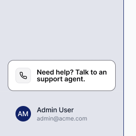
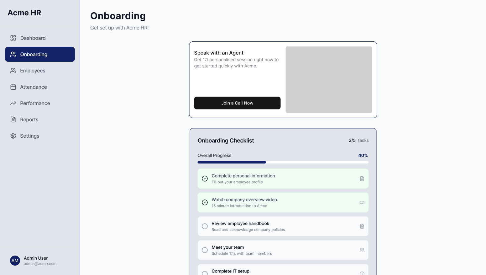
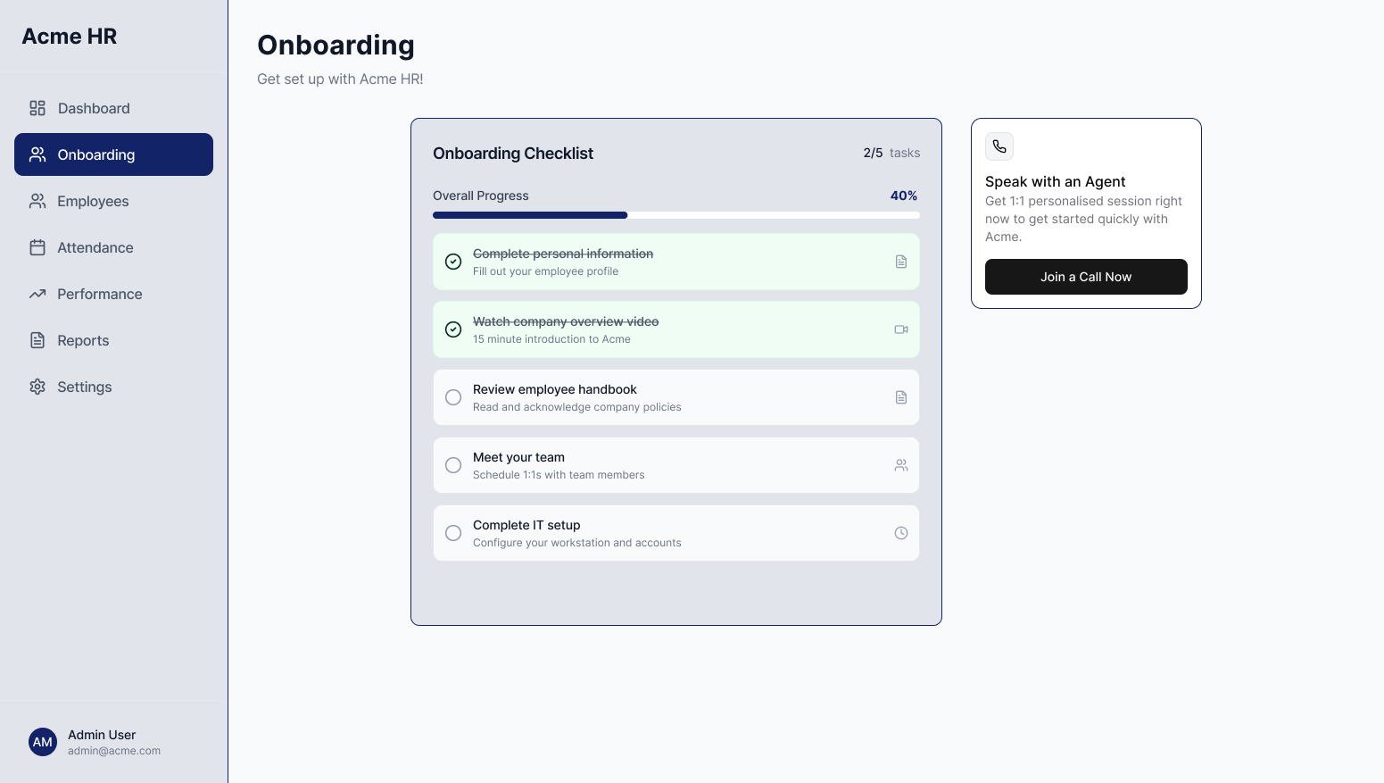
We recommend customizing the components that launch your Quarterzip agents to provide more context and increase engagement. High-conversion components include:Banners
Full-widthHigh visibility. Ideal for guiding new users through onboarding.
Draws attention without dominating the interface. Works well in onboarding flows, support centers, or for contextual help and feature discovery.

Lightweight and unobtrusive. Ideal for sidebars to provide persistent help throughout the user journey.
Cards
LargeWorks well in dashboards or product layouts. Provides space for a short description alongside the CTA.
Compact and flexible. Best for side panels, help sections, or areas with limited space where support should still be easy to find.
Choosing the right copy
Your CTA copy should clearly signal what the experience is and why a user should start a call. Below are examples of what works and what to avoid.What works
| Tip | Example |
|---|---|
| Make it clear this is a voice experience | Use phrases like “Join a Call” or “Talk to an Agent.” |
| Highlight that the experience is personal | “1:1 onboarding”, “Personalized support session.” |
| Create Urgency | “Get support now,” “Join a call,” “Talk to an agent.” |
| Provide context for the help offered | Tell users what the agent will help with: onboarding, setup, troubleshooting, support. |
| Support international users | “Get support in your language.” |
| Use clear support icons | Question mark or phone icons perform well and signal help to users. |
Avoid
| Avoid | Reason |
|---|---|
| Not clearly stating that this is a voice call | If users don’t understand they are starting a call, engagement and call completion drop. |
| Using terms like “Product Tour” | This signals a static, non-personalized experience, which lowers conversion. |
| Ambiguous icons | Icons like microphones or headsets often perform poorly because they don’t clearly signal support or help. |